By Stephanie Sims
Buyers can’t always visualize themselves living in newly constructed spaces. Often, buyers are looking at completely bare spaces, not even a model unit. But model units, decorated to appeal to the targeted buyer, can make a difference when it comes to sales and moving units.
Mary Cook, head of Mary Cook Associates, an interior design firm based in Chicago, knows this firsthand. During the recession, she noticed about 80 percent of the jobs her firm was hired to design were basically fixing another designer’s work, and helping the property target its demographic of buyers. The perspective she and her employees have when taking on a job is not “how can we create a cool space,” she says, but “how can we demonstrate livability and function in a space that speaks to a desired demographic?”
“Seven fundamentals need to be in place, not only in presence, but interaction with the other six creates harmony when it exists,” Cook says. “Take functionality, mobility, scale and proportion, light and lighting, pattern and texture, color and significant and relevant ornament, and when all seven of those things come together, good things happen, like, people buy real estate.”
In a book coming out later this year, called “Art of Space,” Cook details several situations where she’s “fixed” the model units of new construction (and non-new construction) properties with drastic before and after photos. “We often get calls because ‘something is missing’, but they’re not sure what,” she says. “They never say ‘we need to reduce the scale of the furniture,’ or ‘we need more accessories.’ But when we design the model units, (developers) rent and sell more homes.”
Here are a few of those before and afters:
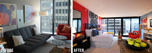
Aqua: Aqua was a new building that had a model unit, but what the building executives wanted – more single, young professional women renters – they weren’t getting. In the before picture, “there’s a lot wrong with the wall,” Cook says. The pictures on the wall were too large for the space, there was no sleeping demonstrated and the color choice made it look bland and boring. Mary Cook Associates reduced the size of what was on the walls, put a bed against the wall instead of a sofa, and “made it more fun” by using bright colors to appeal to young, professional women. Aqua hadn’t rented anything in three months, but the day that model unit was installed, they rented one apartment, and rented 13 more in three weeks.
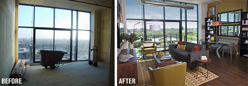
Van Buren Lofts: The floor plans for Van Buren Lofts were not attracting the building’s desired demographic – young couples. “The biggest issue was with the loft space – it’s a shared space, and it’s hard to make everything fit for urban living,” Cook says. “They can’t buy a big, heavy sofa to put in the family room like in the suburbs because it won’t work. These buyers need to know how to do it with urban flair.” Instead, she installed a shelving unit and used a smaller loveseat instead of a sofa, to partition the room. After unveiling Mary Cook Associates’ model unit, Van Buren Lofts sold four units in 30 days, at the rate of one per week.

